Let's review the last part of the Chart Attack Report, Real Estate! Before we dig in, just a quick reminder that this section is part of the report you might have already downloaded, If you haven't downloaded it, you can register to do so for free here: Register

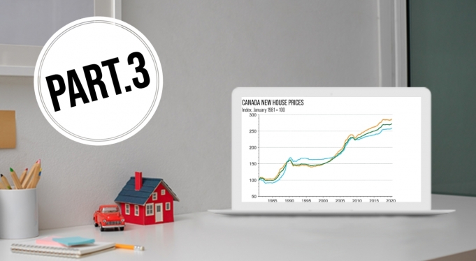
New House Prices
Like it or not, housing is a huge contributor to the Canadian economy. Ignoring housing would be ignoring a big driver for the well-being of most Canadians in some form or fashion. This chart tracks the trend of housing price growth for new purchases.
House Price to Income Ratio
While real estate prices are interesting on their own, having more context for them is far more helpful. As a crude example if a house costs a million dollars but the average income in a country is two million, affordability is not an issue. If the average income is $50,000, the situation is far different. So, this chart helps provide a bit of context into the affordability of housing. This chart also compares Canada, US and the UK to one another for added context.
Percent Change in New House Prices
This chart shows the 12-month percentage change in housing. This is helpful as it helps us understand the rate at which house prices are changing. If there are sharp and quick rises in prices, the average individual may not be able to keep pace with the change in prices and get priced out of the market. It can also help to show if there is any frothiness in a market.
House Price to Rent
This is another way to look at affordability and helps us understand how much more expensive house prices are relative to renting. The higher the number, the costlier owning is compared to renting. Most are probably not surprised to hear this, but Canada is the most expensive on this metric.
House Price to Income - All Countries
This chart depicts the house prices of numerous countries for comparison on a global scale. Countries with the lower housing prices should have a longer-term tailwind in terms of an economic driver as home ownership and prices rise, lifting the broader economy.
We have given some insight into the charts we view as offering strong insight into the market and the economy, helping an investor quickly and efficiently understand what is going on at a high level. Take some time to read through the charts, understand them and find your own takeaways and conclusions for your own investment process. Also, don’t forget to drop any requests for new charts to add to this series in the comment section below.
Happy Investing,
![]()
P.S. Please note that this blog series references three sections of one report. Once you have signed up to receive the download link, you will automatically receive a link for the next available report, which will be published in about 2 months.


Comments are disabled on this post.
Comments are disabled on this post.